
Display Trends
Company Rebrand
the challenge
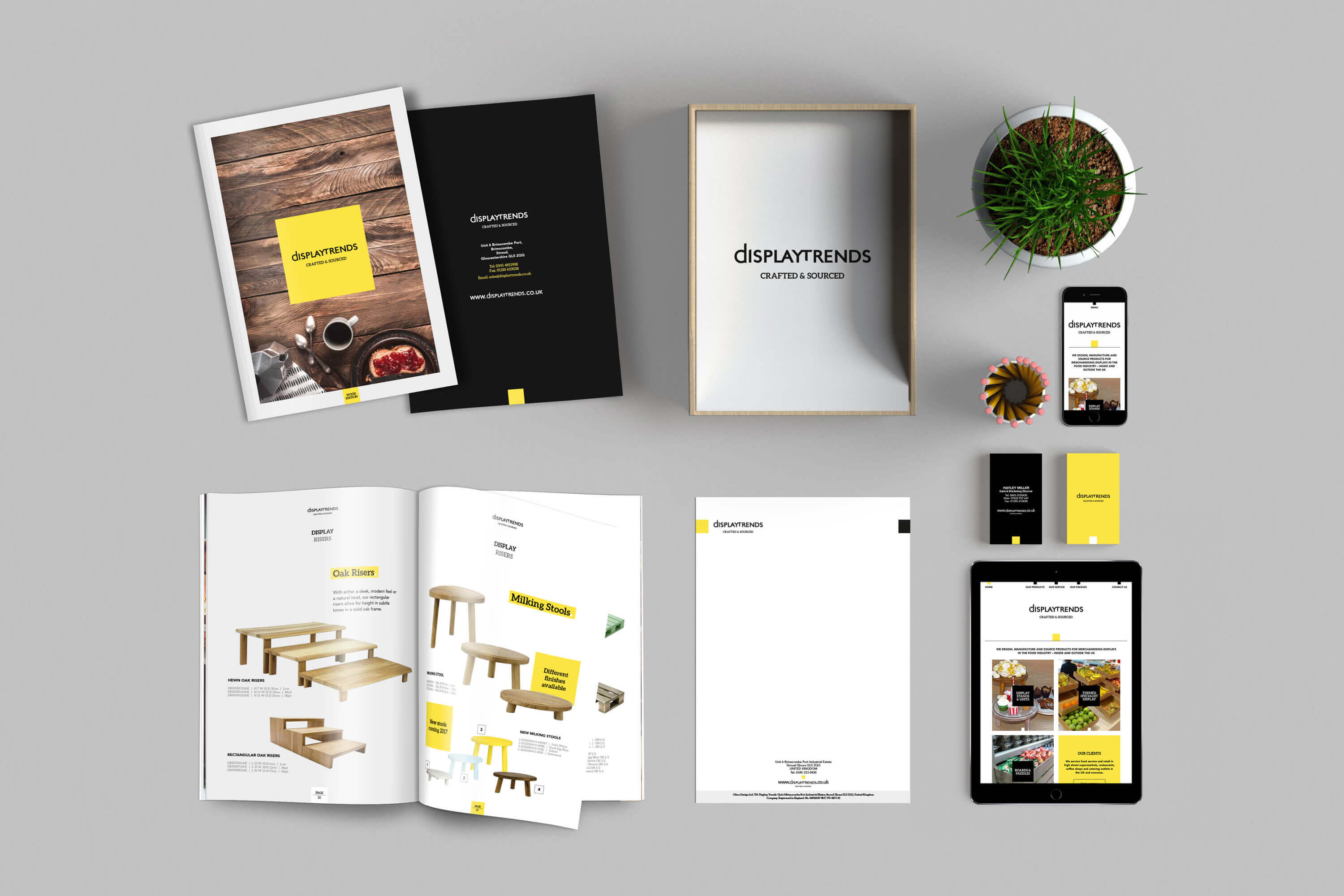
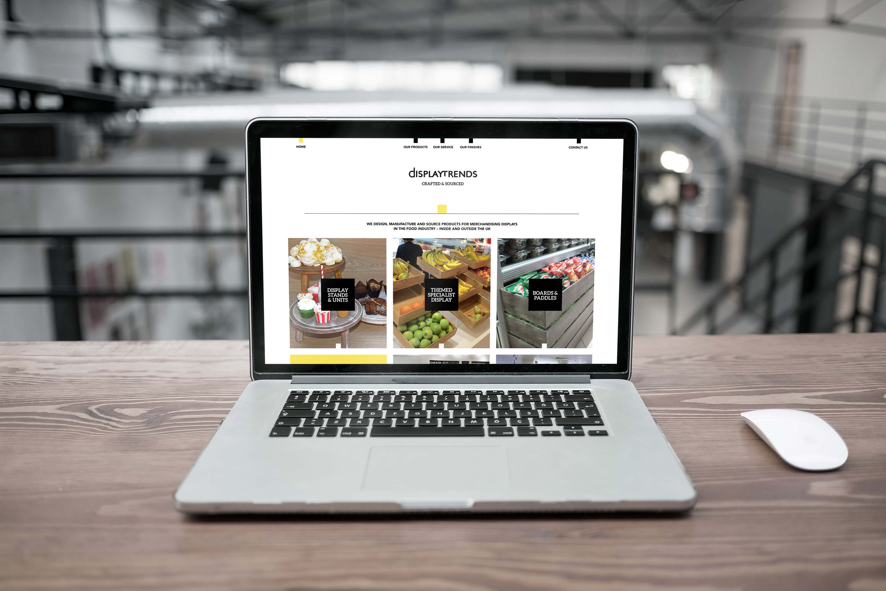
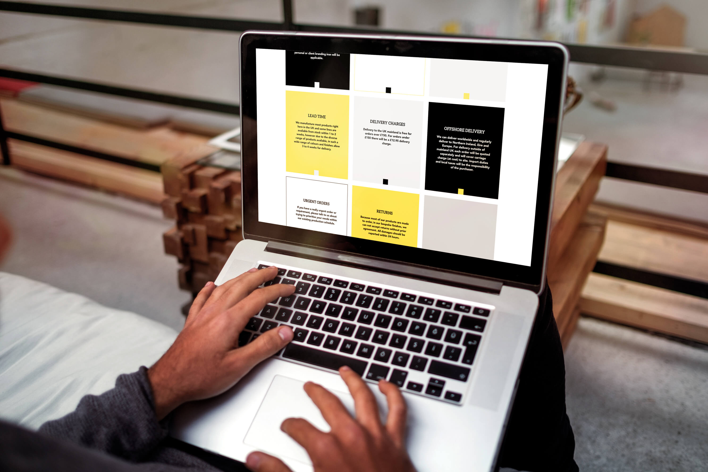
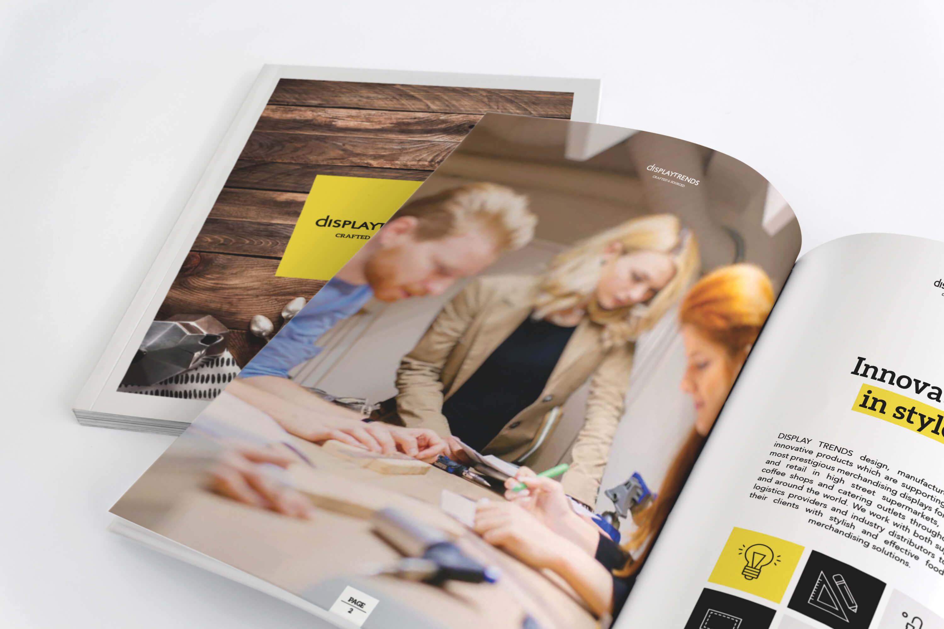
This was a challenging rebrand and website project. When Display Trends approached Tiny, their brand and website was basic and needed to be brought up to date quickly to stand out from competition. Their old logo was in need of a professional touch. The website wasn't up to modern standards and needed to be tightened under a single striking identity. Removing an old clipart type of wood effect from the logo would to help to suggest they weren't just about wooden products too!
the concept
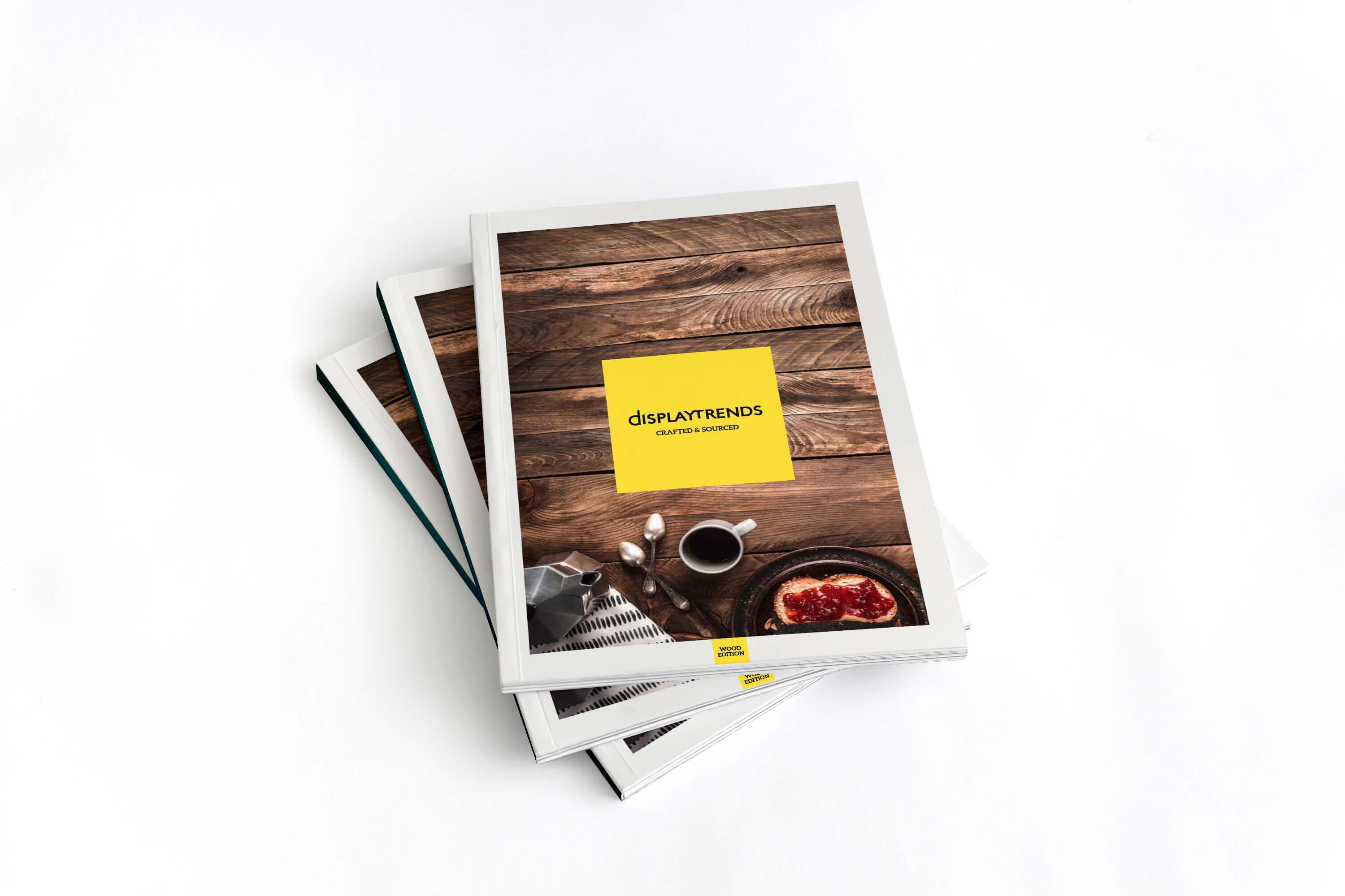
We wanted to make sure that the new brand still touched on the crafted aspect of the company but we told 'no wood, no product related colour'. A tricky prospect! Our initial designs focused on created the idea of display using the letters 'd' and 't'. This developed into more a hipster style logo using a diagonal cross before we ditched the cross and stuck to simplicity.
the finish
Colour played an important part in the rebrand too. We were restricted from anything brown, orange, or wood related so we focused on colours that weren't necessarily traditional 'crafty' colours. The brand went through a phase of a teal and yellow with black and white before we finally stripped it back to just yellow, black and white (and a little grey!). The yellow kept the feel of craft but also helped to produce an element of the 'display' being bright. All in all we're really happy with the final outcome!
