Especial
The Especial Rebrand
the challenge
Especial came to Tiny to completely overhaul their website and branding. Their company produces and sources products for in-store food presentation for retail and food establishments. The old website needed to be tidied up, brought up-to-date and turned into something visual to stand out from their competitors. At the same time the brand also needed to have a much needed refresh.
the concept
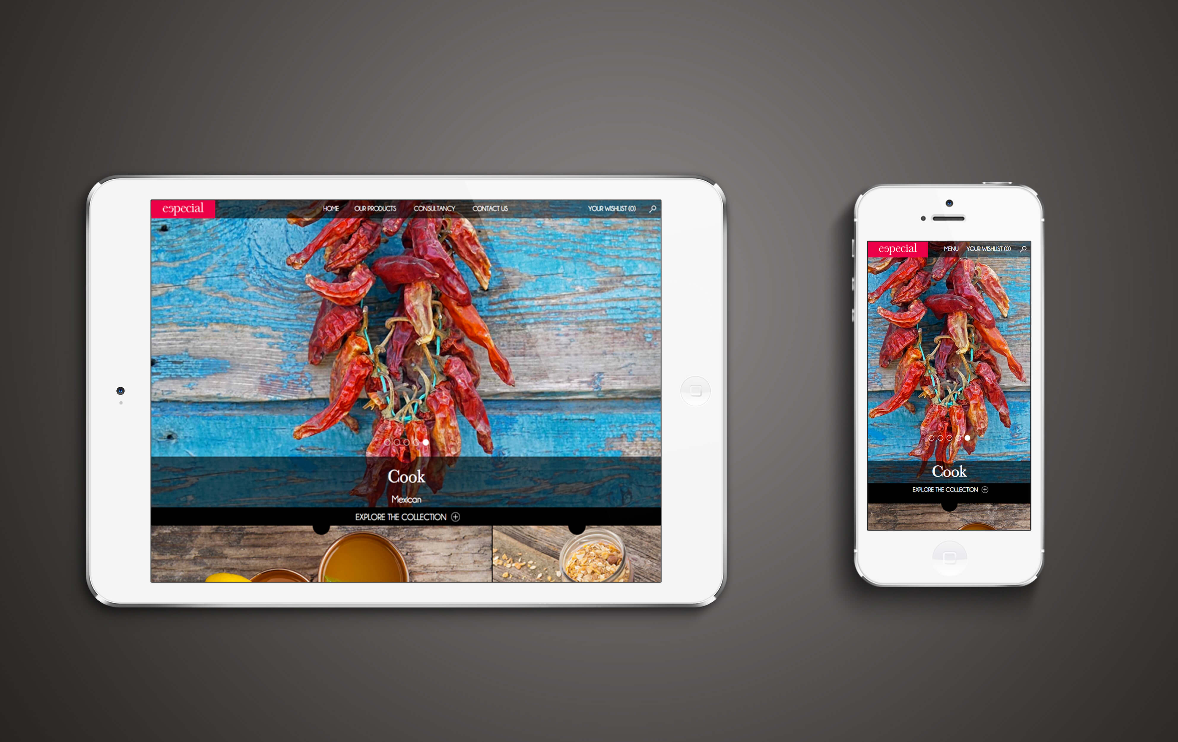
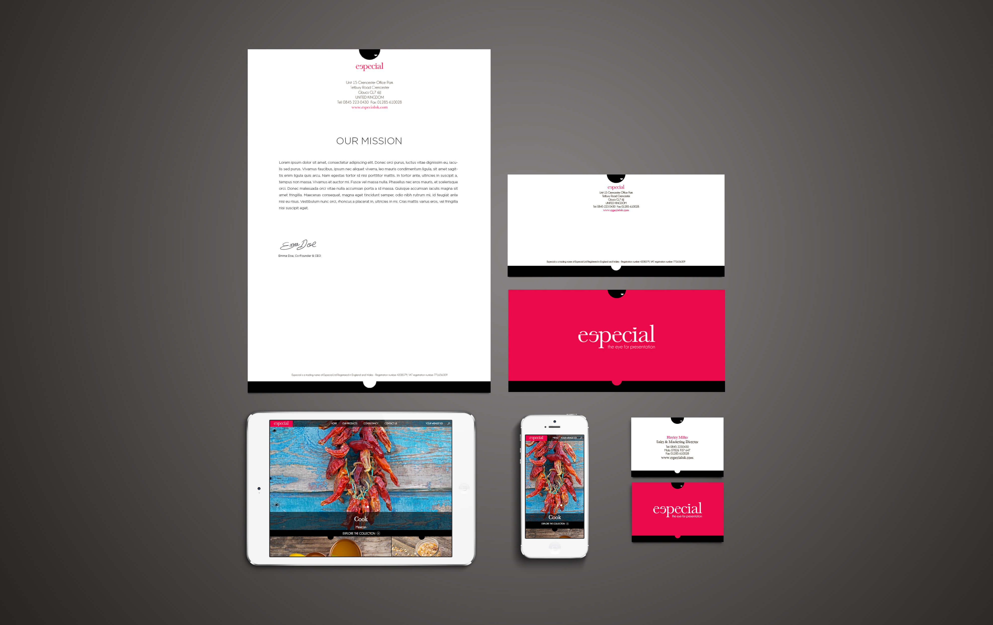
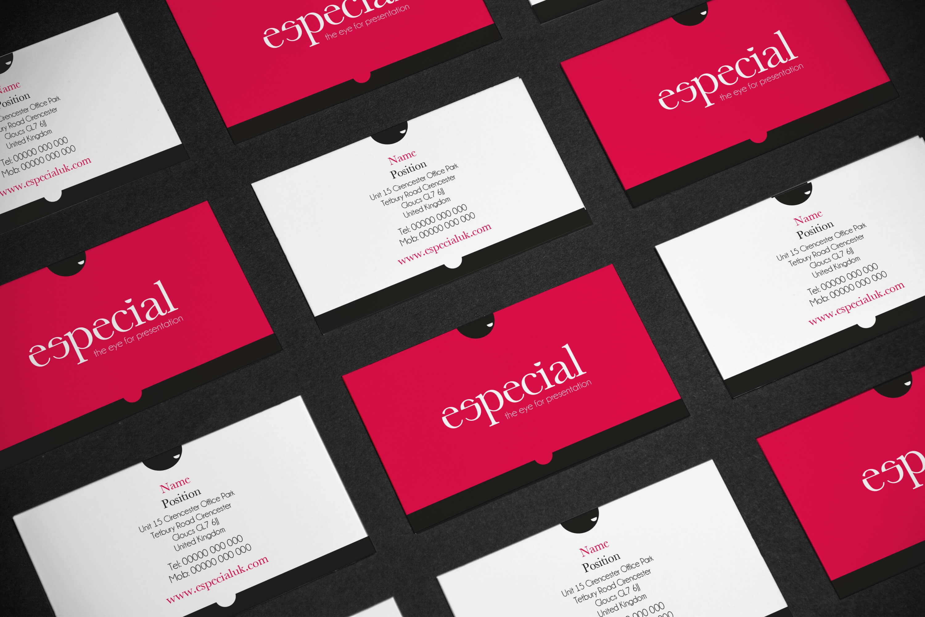
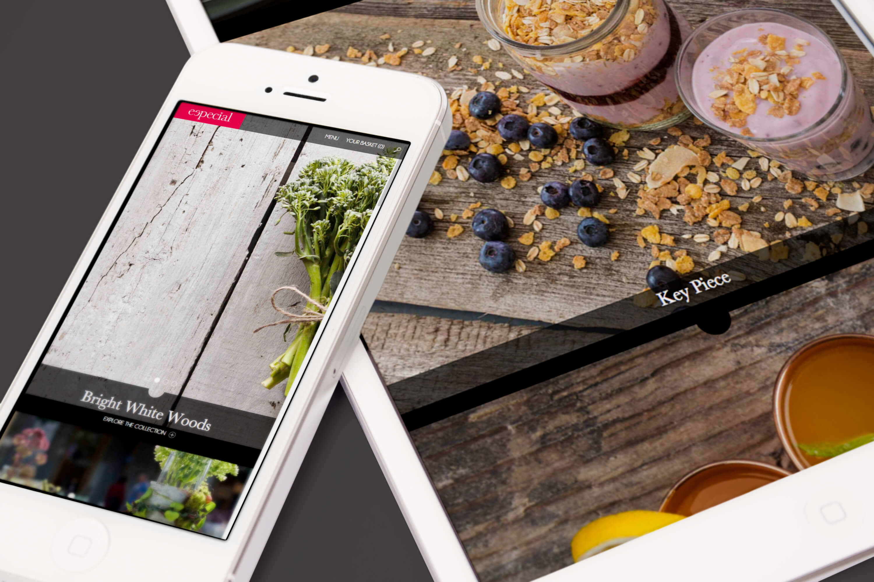
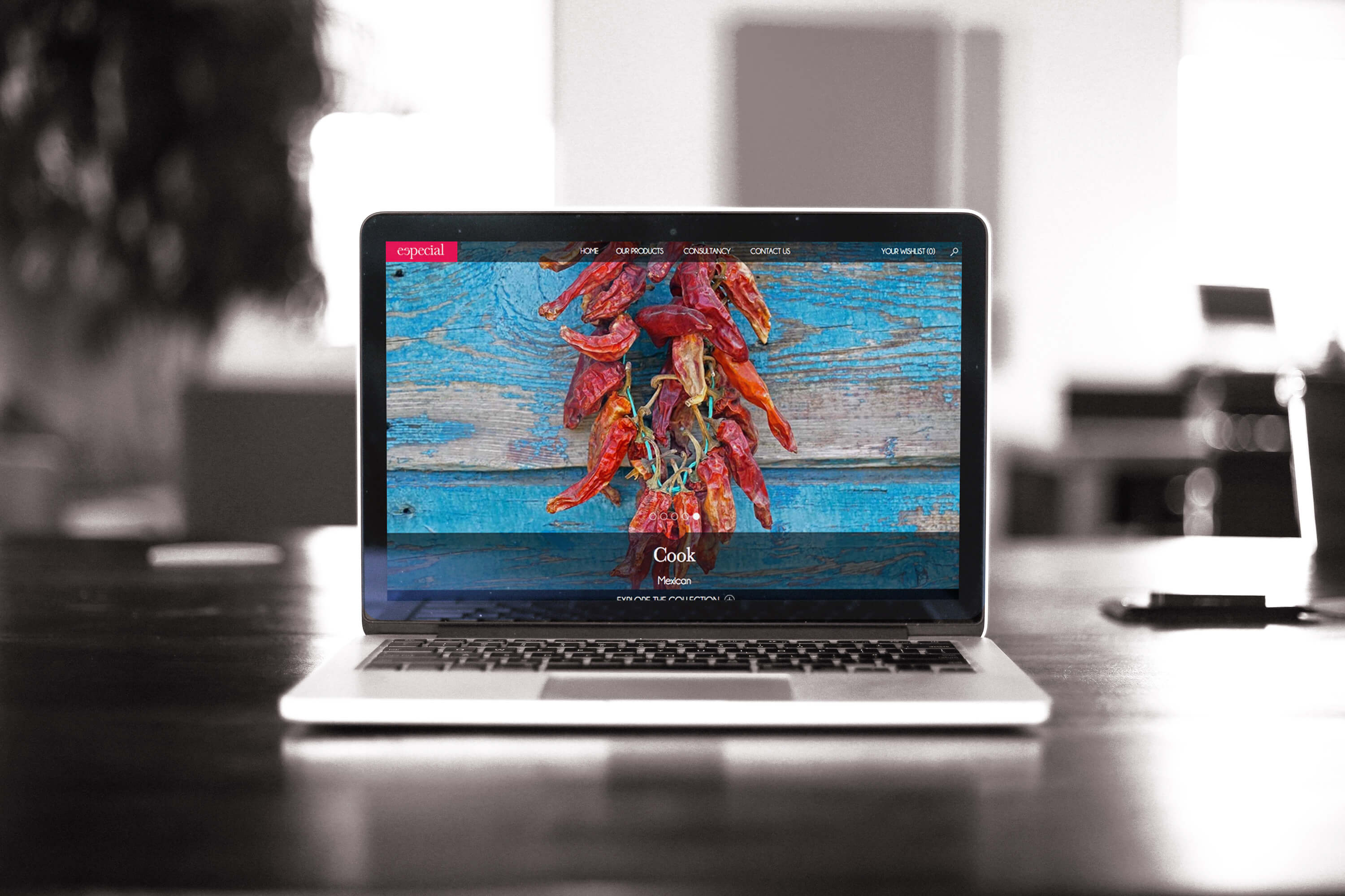
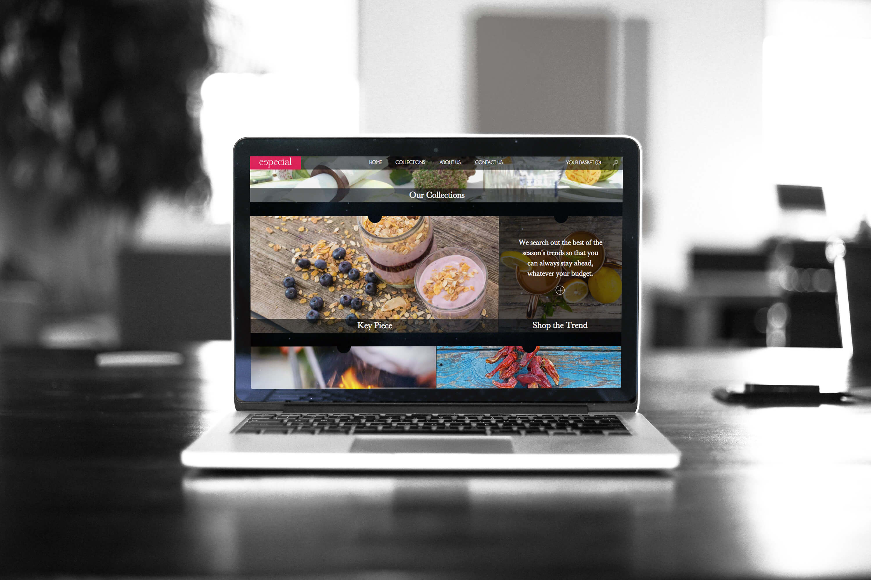
The branding focused on two elements – the website and the logo. We wanted the Especial website to have a consumer feel but made for business to business contact. To do this we came up with the concept of a magazine style website. The logo pulls several elements together – the 'e' in especial (more than just special), the black melanine bowls which Especial can provide – but most importantly, the eye. We came up with the eye for presentation.
the finish
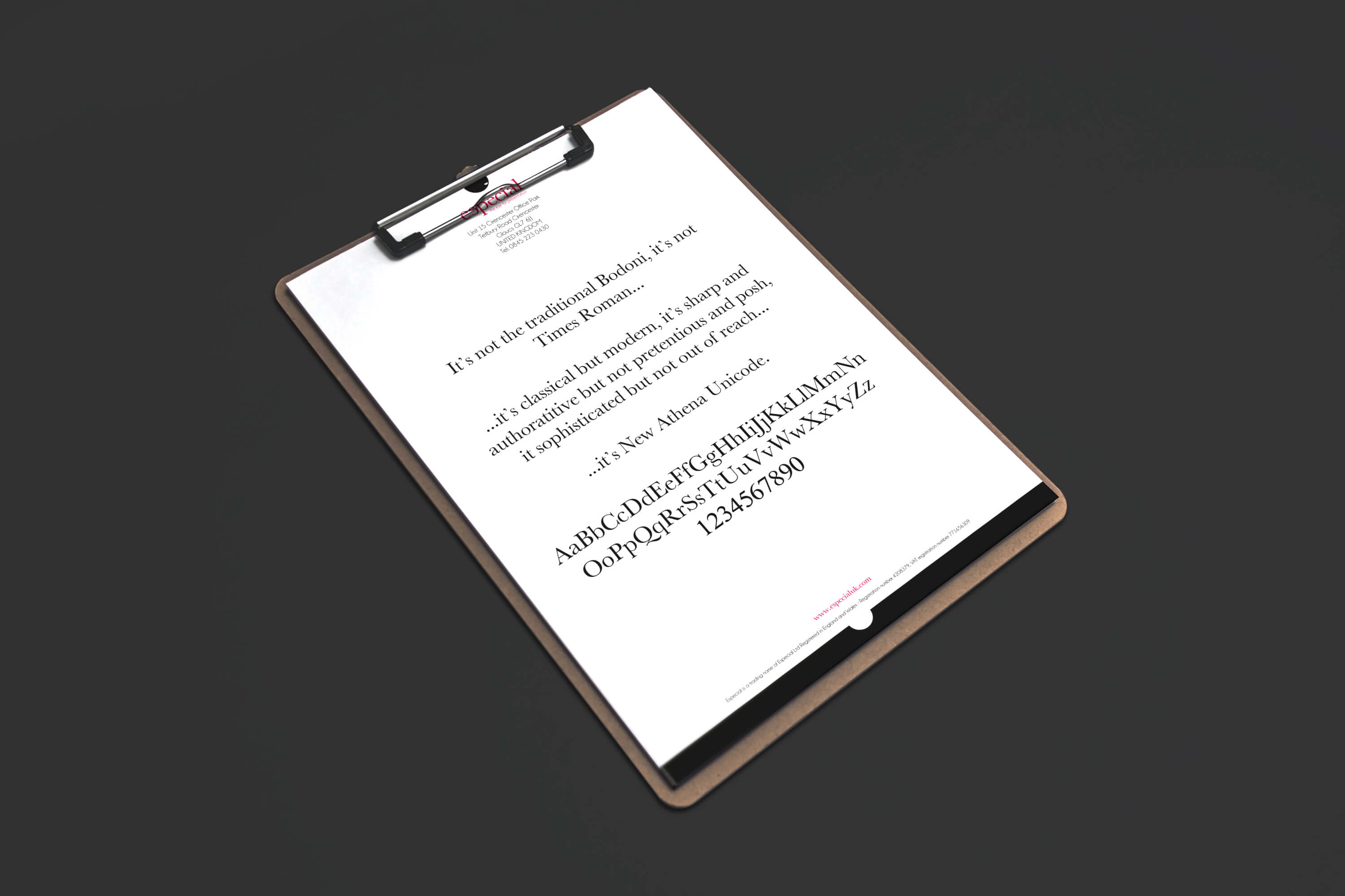
We targeted the new concept towards the eye for presentation. We created the half pupil logo consisting of the black and white bowls giving the impression of the all-seeing eye. Along with this, the new logotype takes the 'e' and produces an 's'. We kept the original red but gave it a makeover - something a little softer and brighter. The new Especial website gives users the opportunity to browse food concepts in the form of magazine style features. Users also get the opportunity to browse and select Especial products which they can use to create wish lists for the quoting process.