Barton Milne Associates
Brand creation & website
the challenge
Create a new logo design and then using that logo within a brand spanking new website. A challenge accepted when Madeleine from Barton Milne Associates contacted Tiny with the request! Barton Milne asked us to come up with design that connected their target companies with targeted candidates. Our first challenge? Coming up with a new way to combine the letters B and M which is not an easy task!
the concept
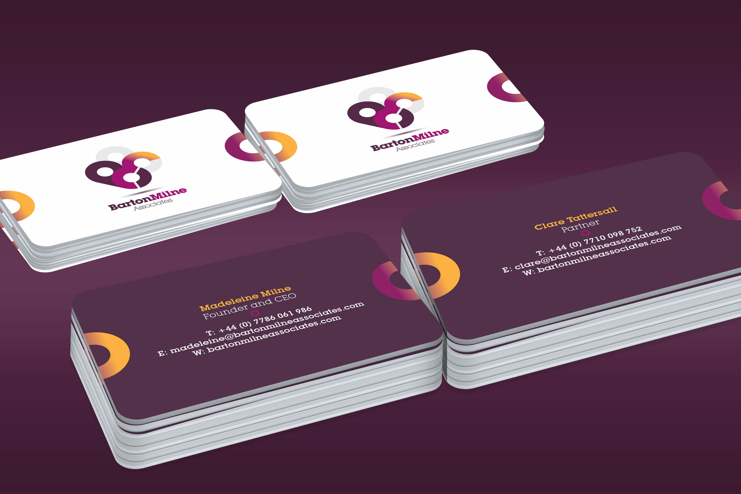
Firstly, we wanted the logo design to cover three important parts – connection, people and the company initials. We wanted it to be bold and simple, so effectively the logo could sit by itself without the company name. The logo's colour was intended to be bold and strong.
the finish
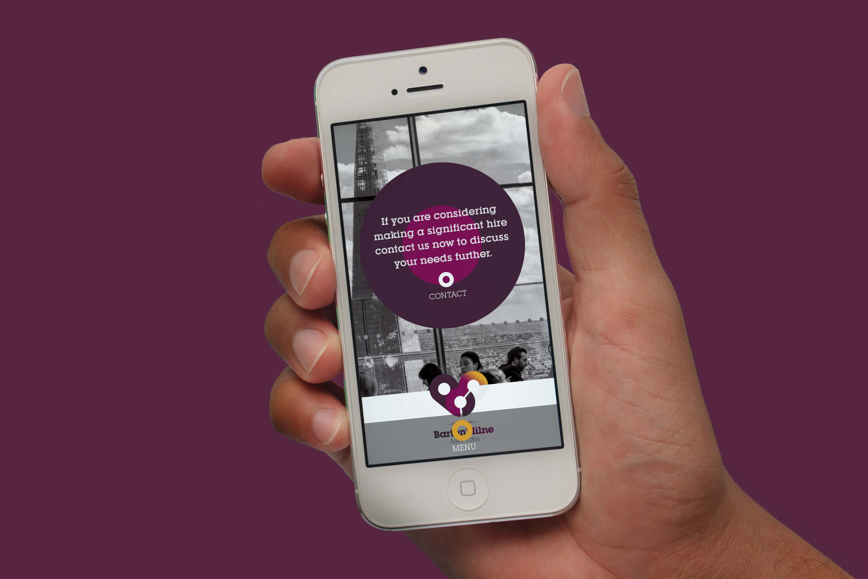
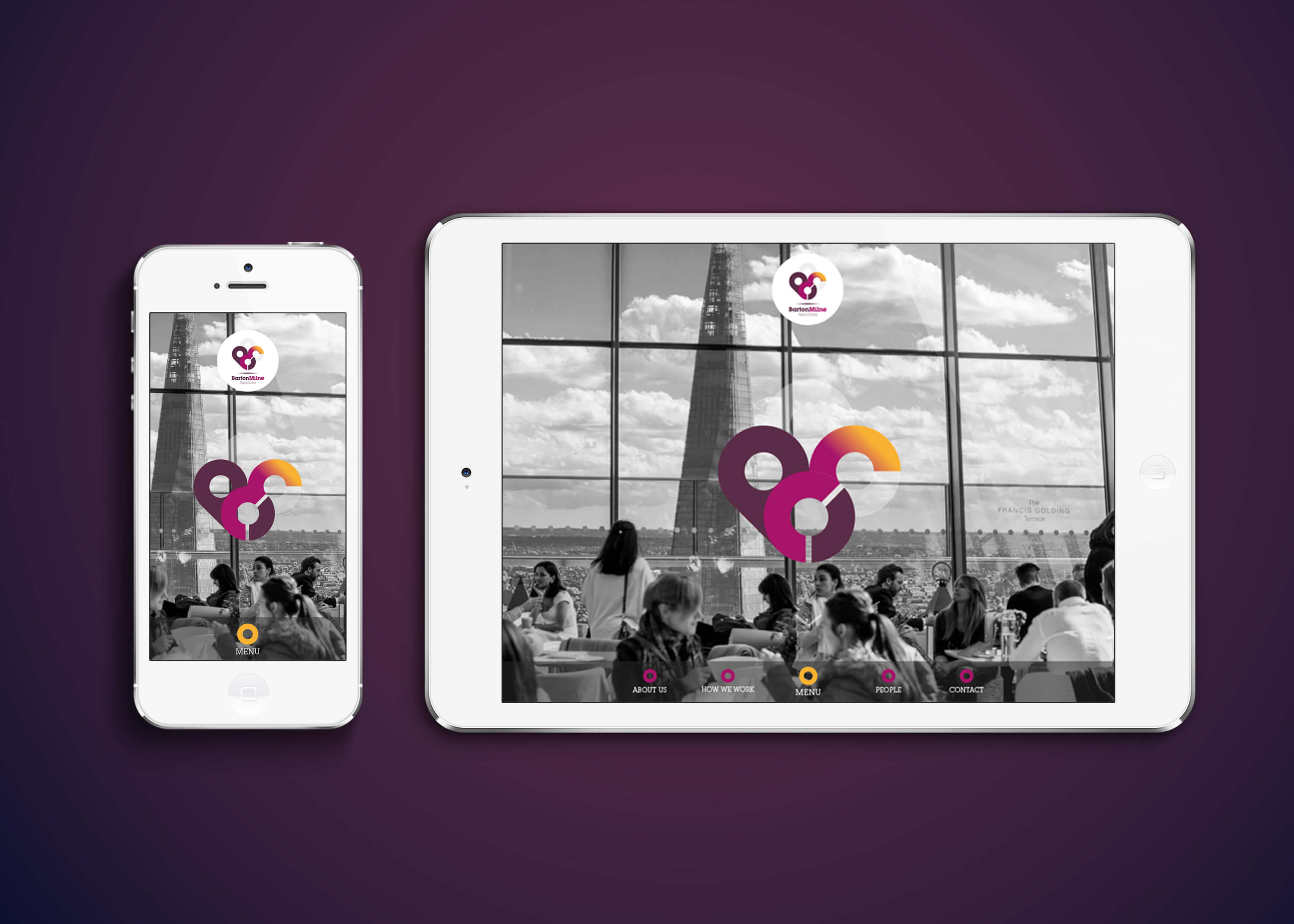
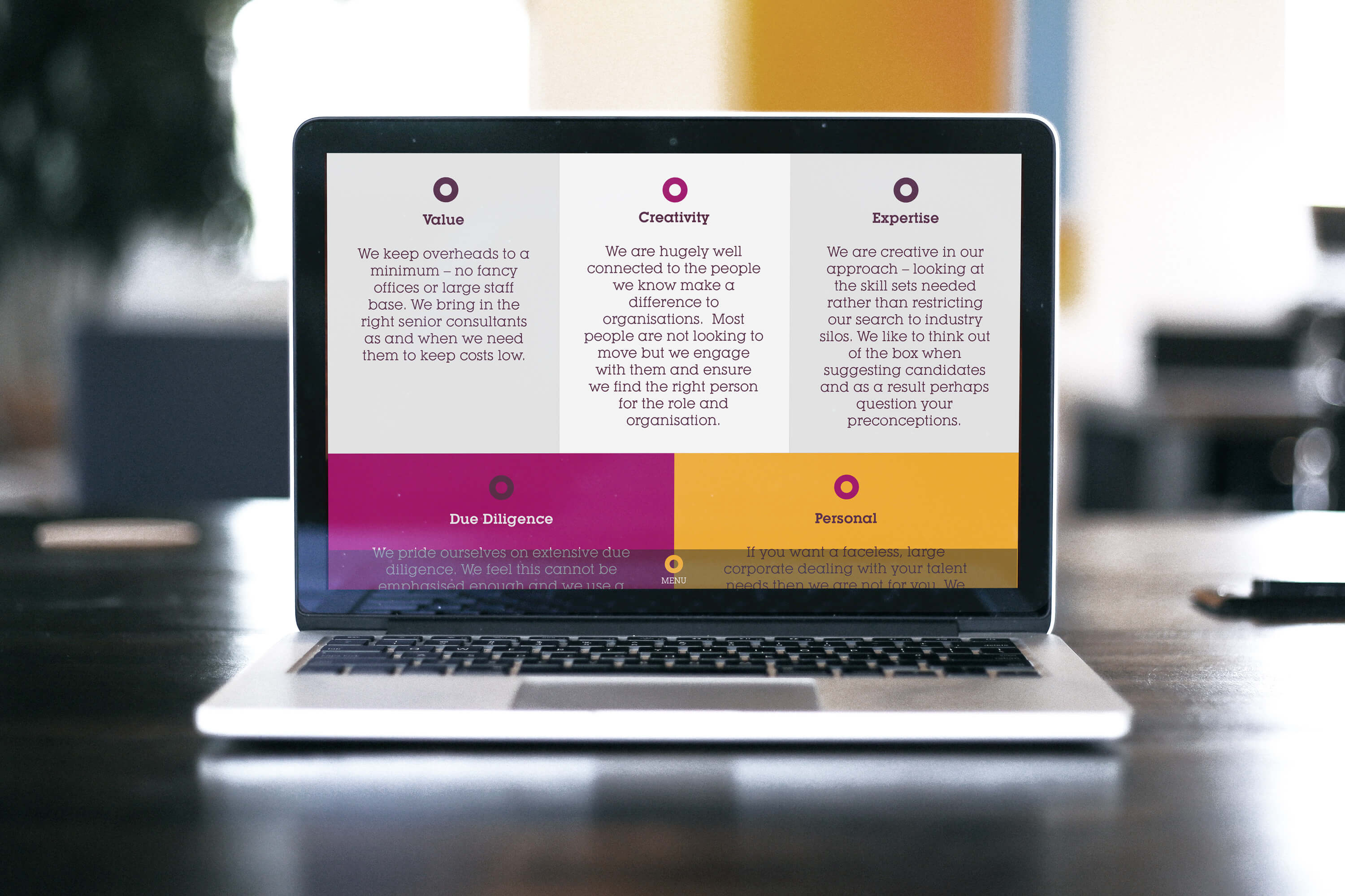
Our solution was a bold iconic logo using circles to represent relationships, evolution, transition, connection and finally, people. All of these ideas connected through shape and movement with colour. Once we had this, our palette of bold colour was transferred to a bold and striking website which continued the circle theme. Everything to do with Barton Milne focuses on these integral themes and ideas and so we strived to have them appear everywhere.