Turning Point Coffee
A new turning point
the challenge
Our friend Stu came to Tiny to design something from scratch for his new coffee brand. Stu is an internationally recognised coffee buyer, roaster and judge, if anyone knows something about coffee, it's him. Our challenge was to come up with something that stood for the same things Stu believed in and wanted his brand to also portray. He wanted to create a brand that heralded the small coffee farmers, was produced sustainably and just looked, and of course, tasted great!
the concept
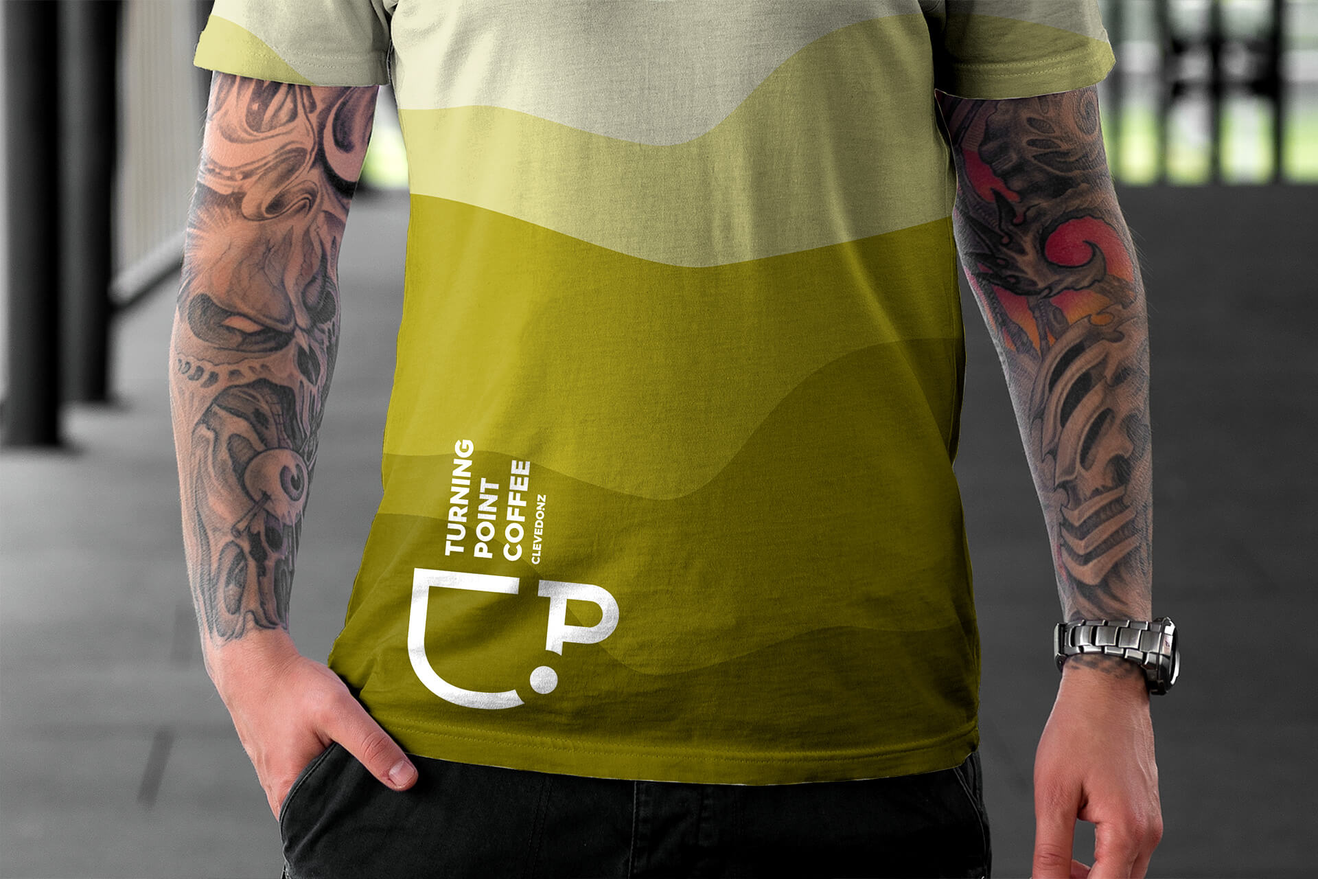
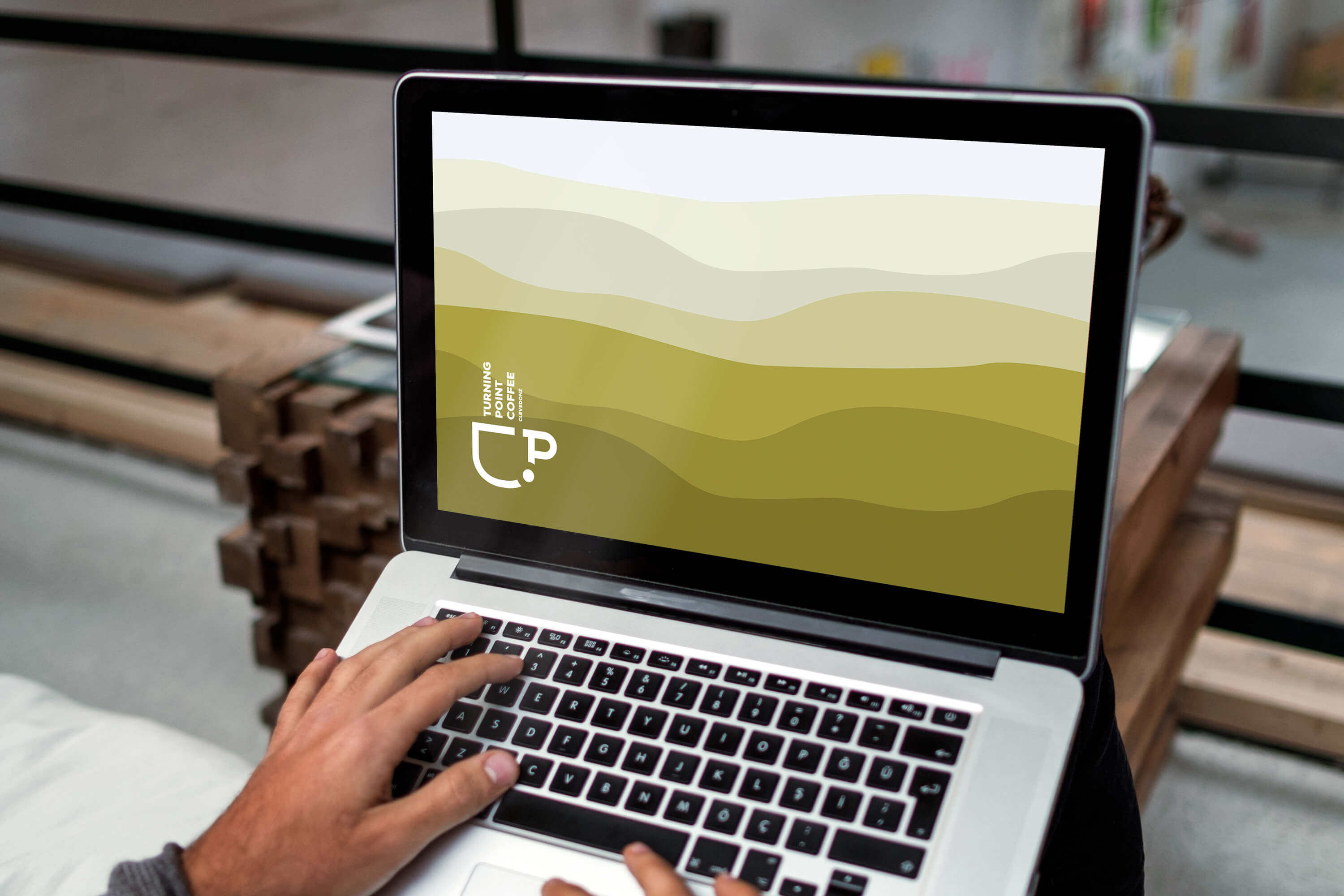
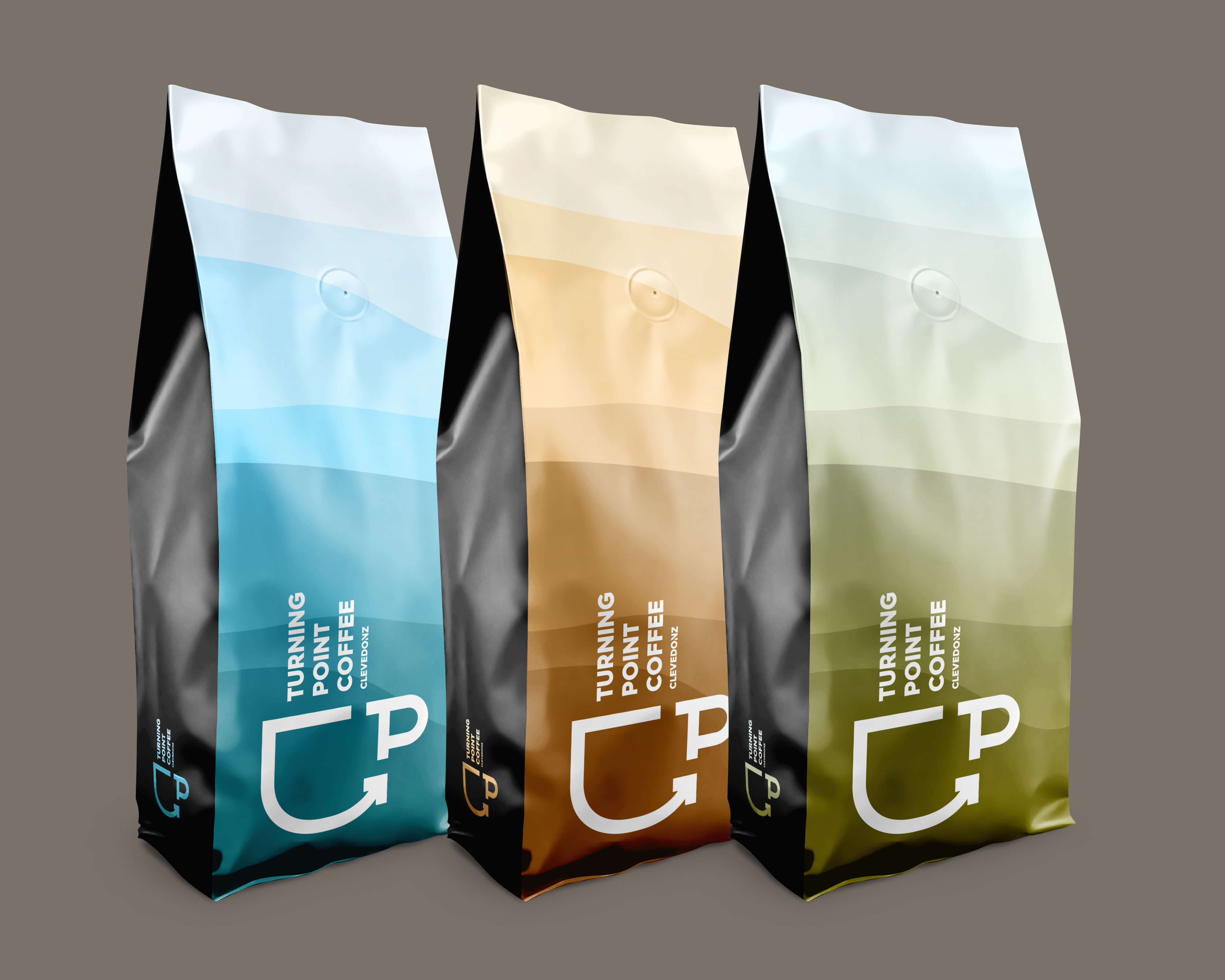
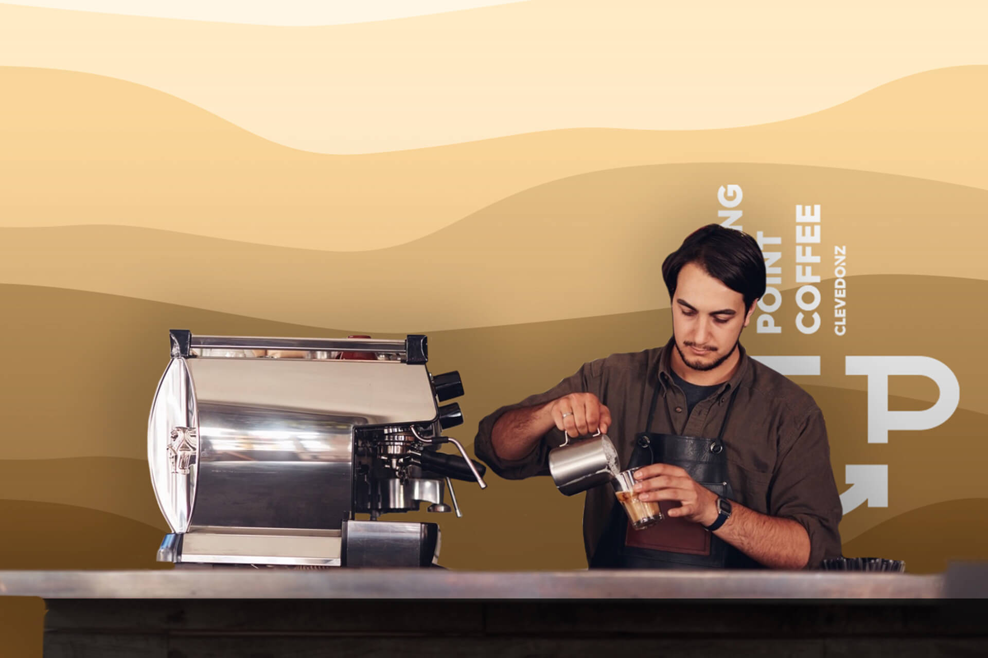
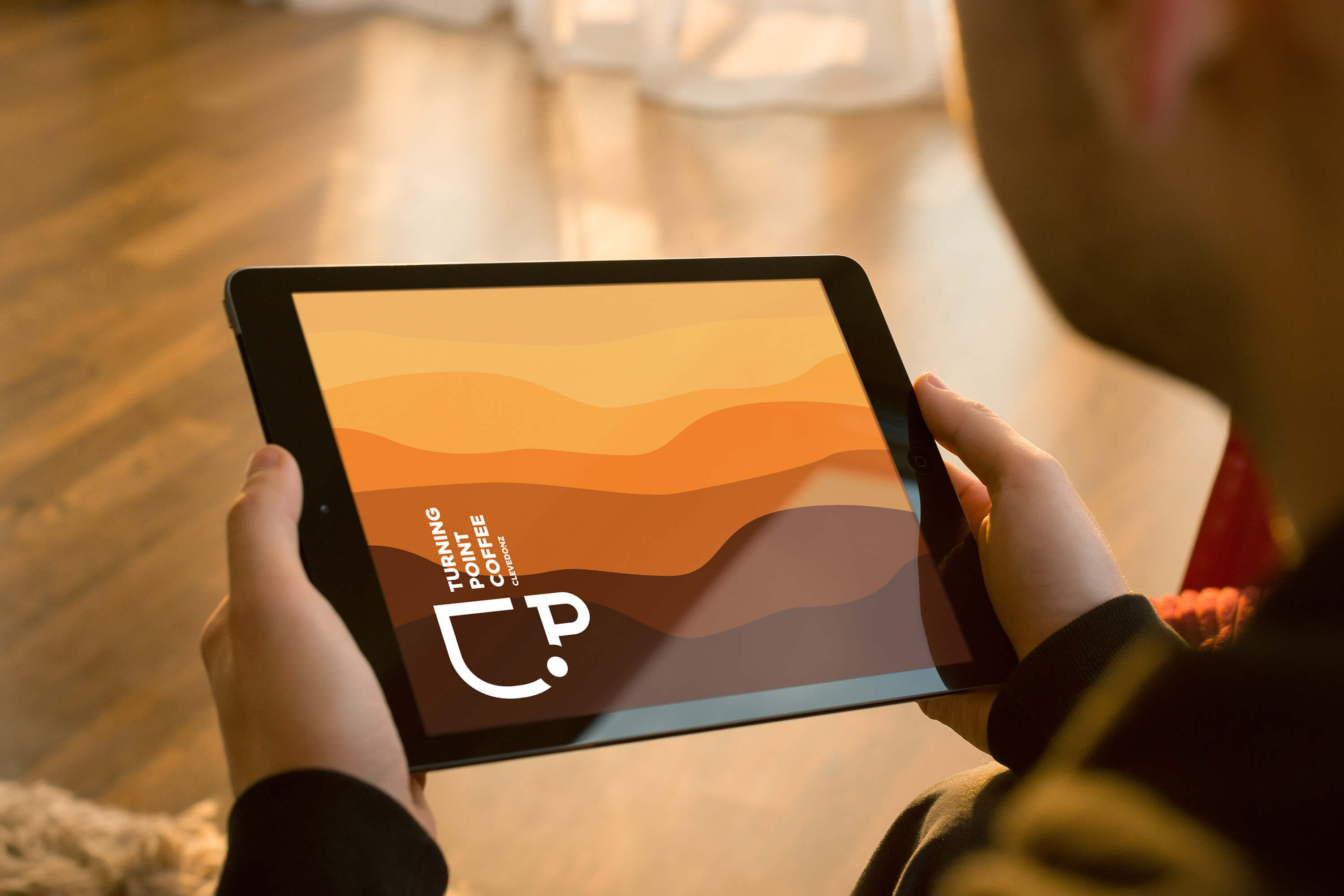
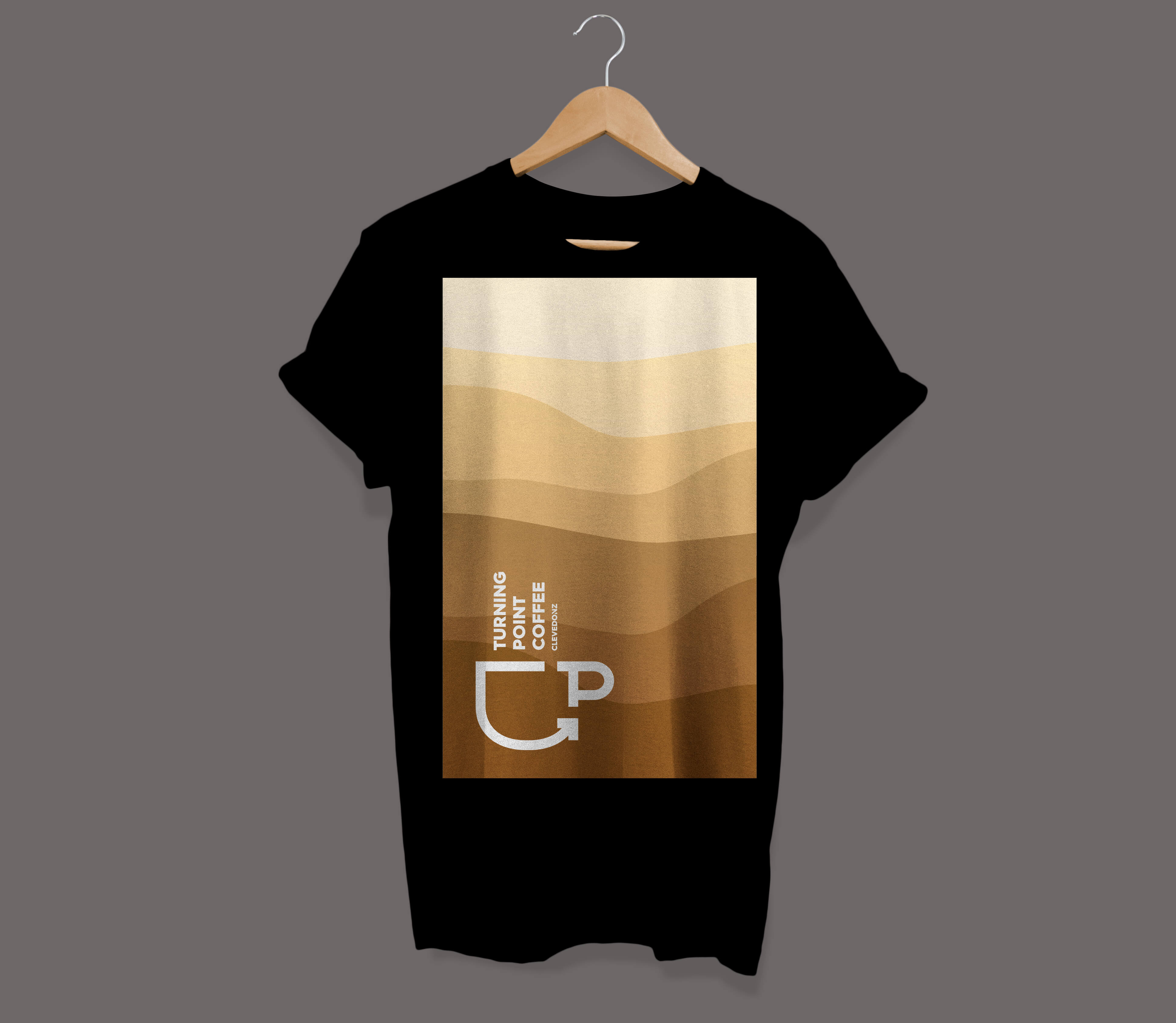
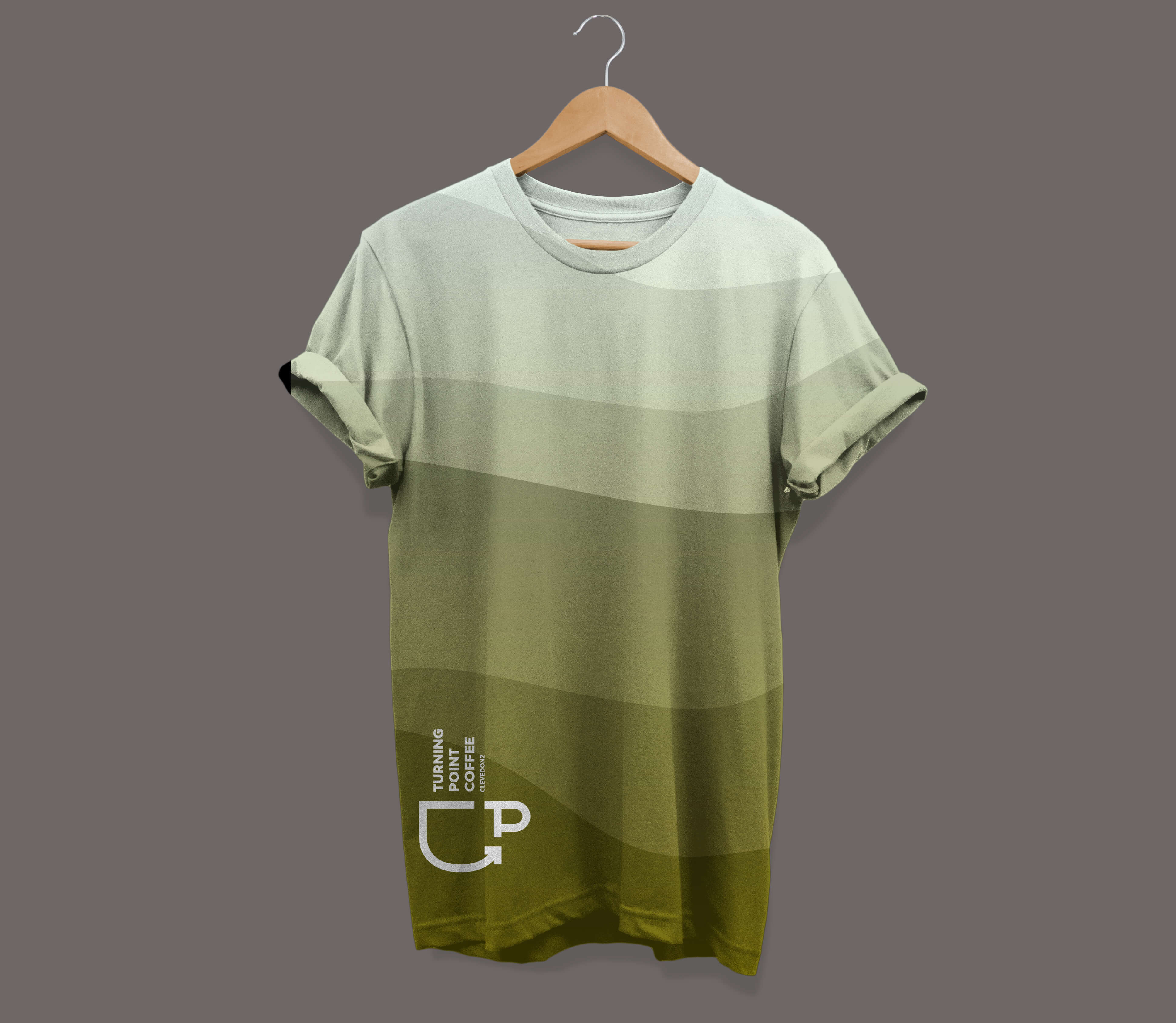
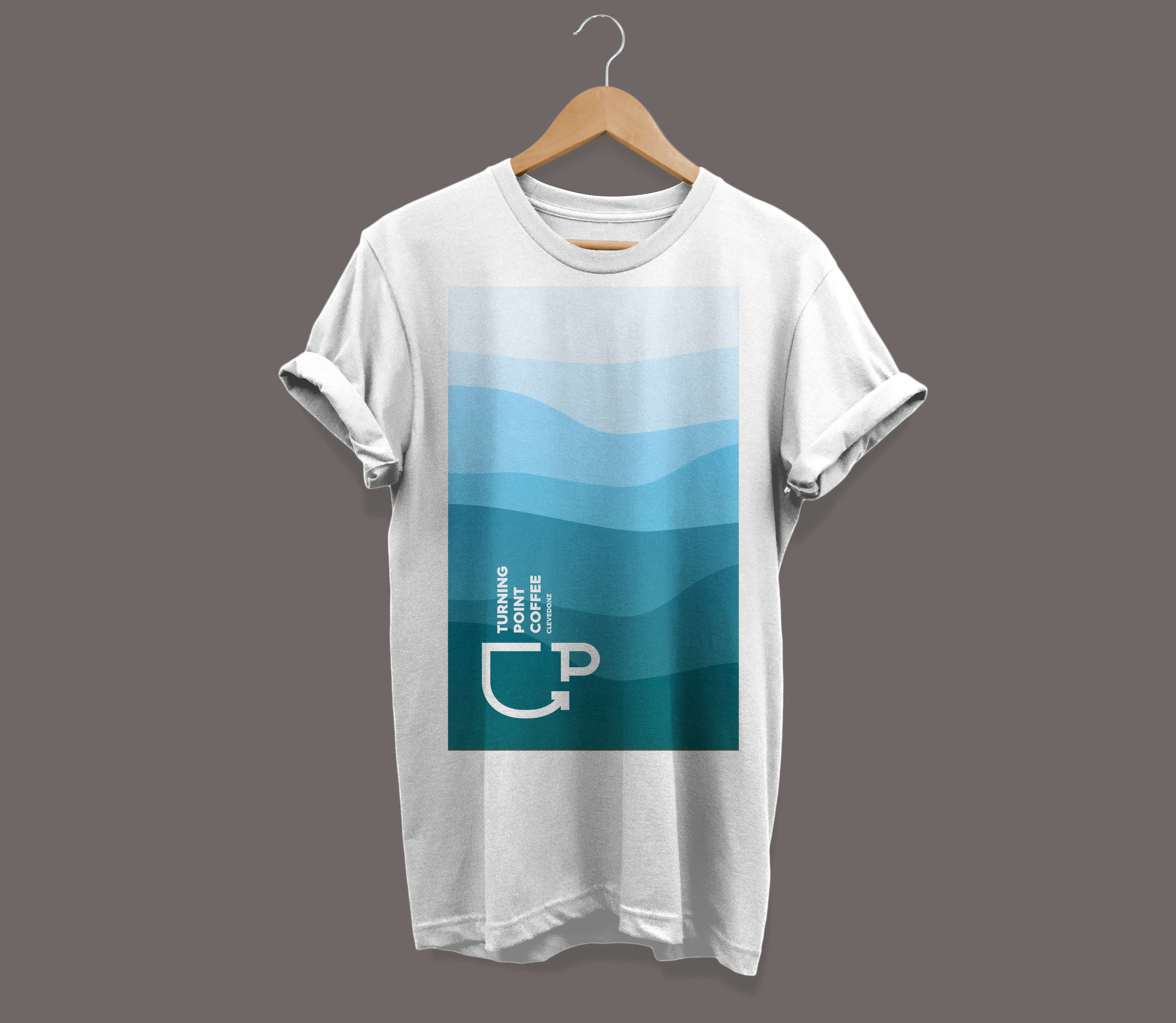
The design concept for the coffee brand came from several mixed elements. Firstly, the term 'turning point' refers to a point in the coffee production process but also was indicator for change - 'brewing change'. Secondly, Stu and his partner Gemma lived overlooking beautiful countryside, with rolling hills that changed appearance throughout the day. We aimed to connect these important elements to the layered effects of pouring good coffees and the remnants of froth, milk and drink left after drinking one.
the finish
We gave the coffee brand a flexible design, allowing the different blends of colours to reflect the different blends of coffee created. Stu could happily choose from four different colour schemes with 3 different tonal ranges within each, meaning 12 different blends could be covered. The foundation colours for the brand being the orange scheme. The logo incorporates the uplift shown in the technical process of roasting, with a pinpoint of where it changes and a subtle creation of the abbreviated 'TP'. What we didn't want to create was a 'hipster' inspired logo that was indistinguishable from lots of other coffee brands.