RBH Properties
Brand, online and marketing
the challenge
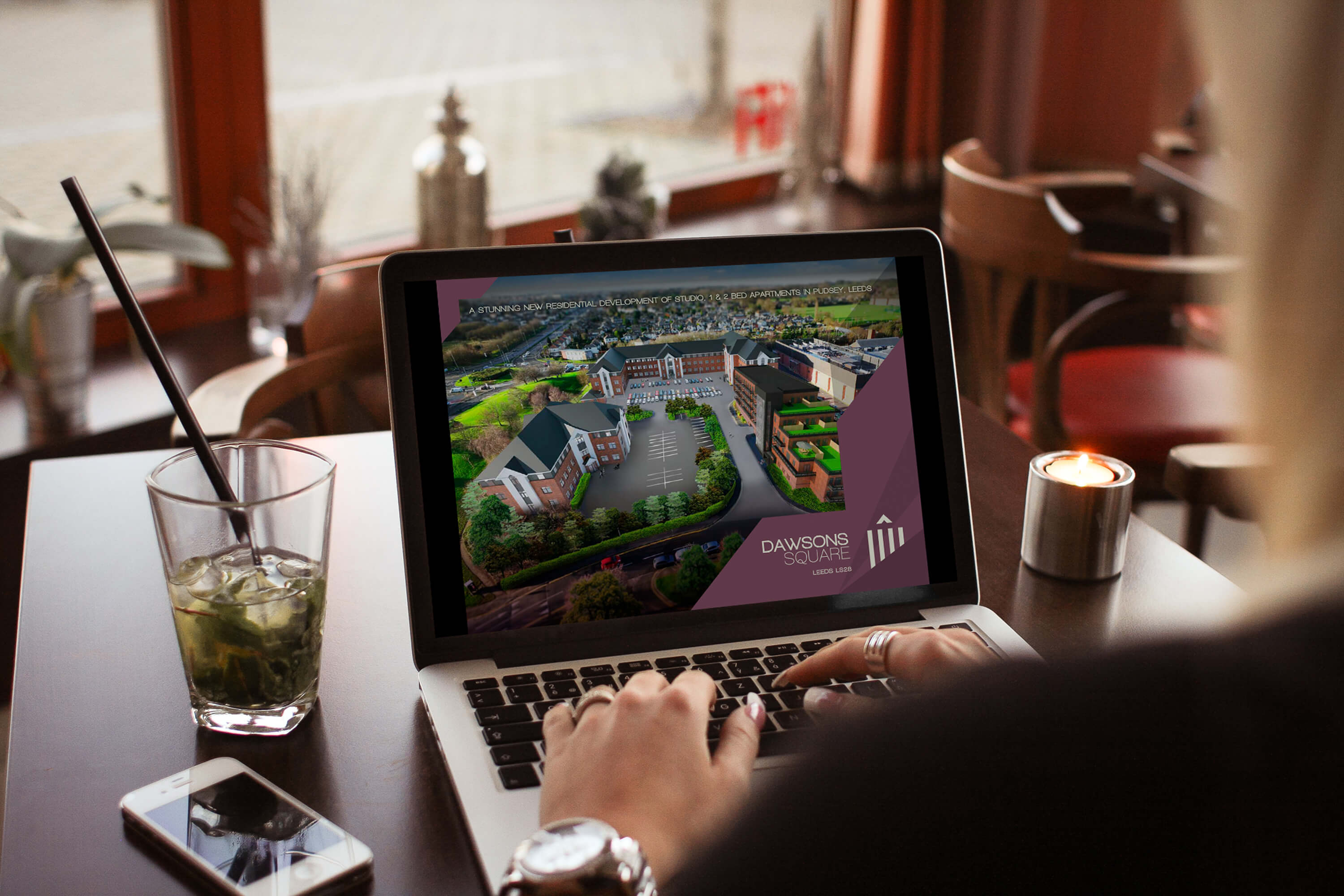
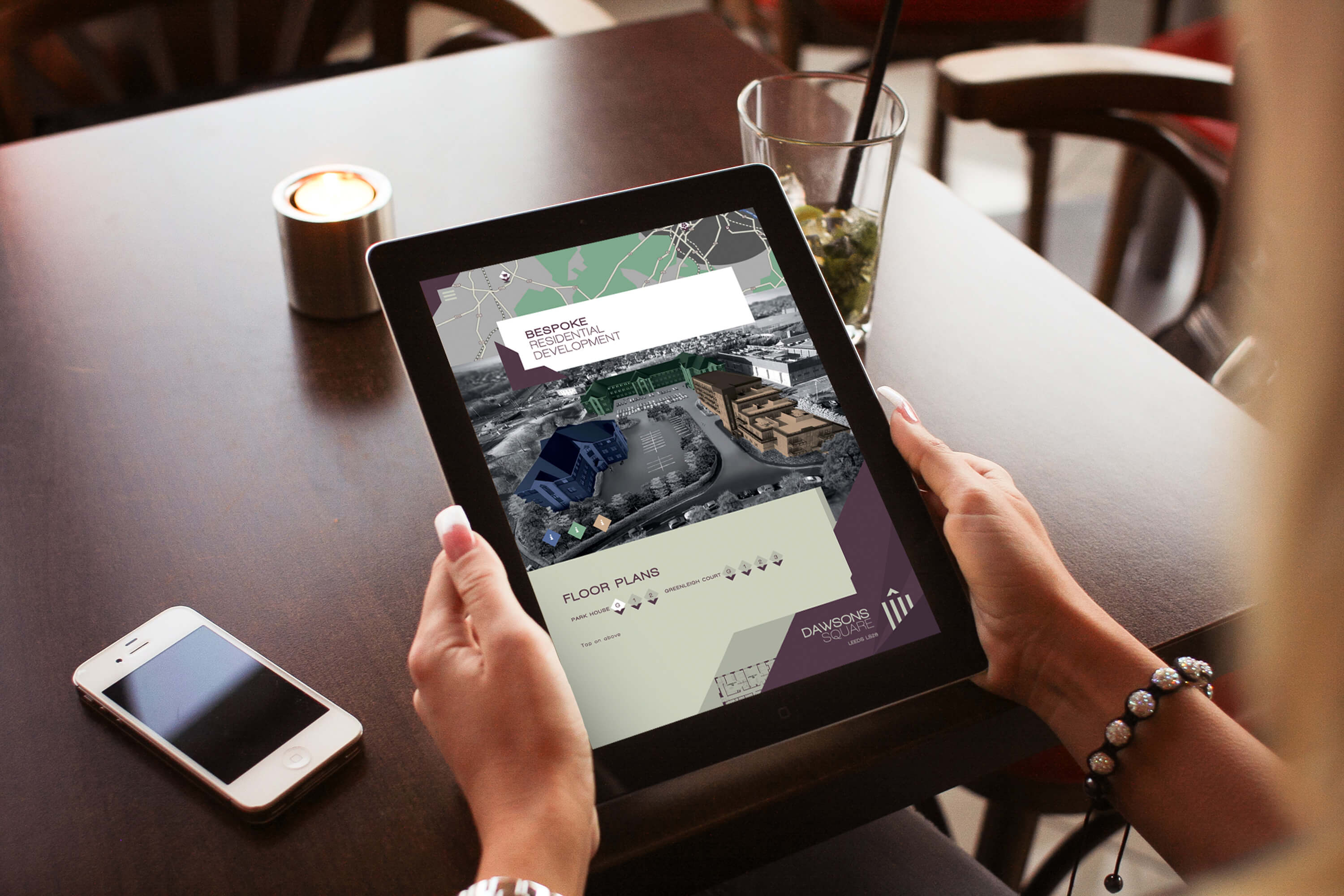
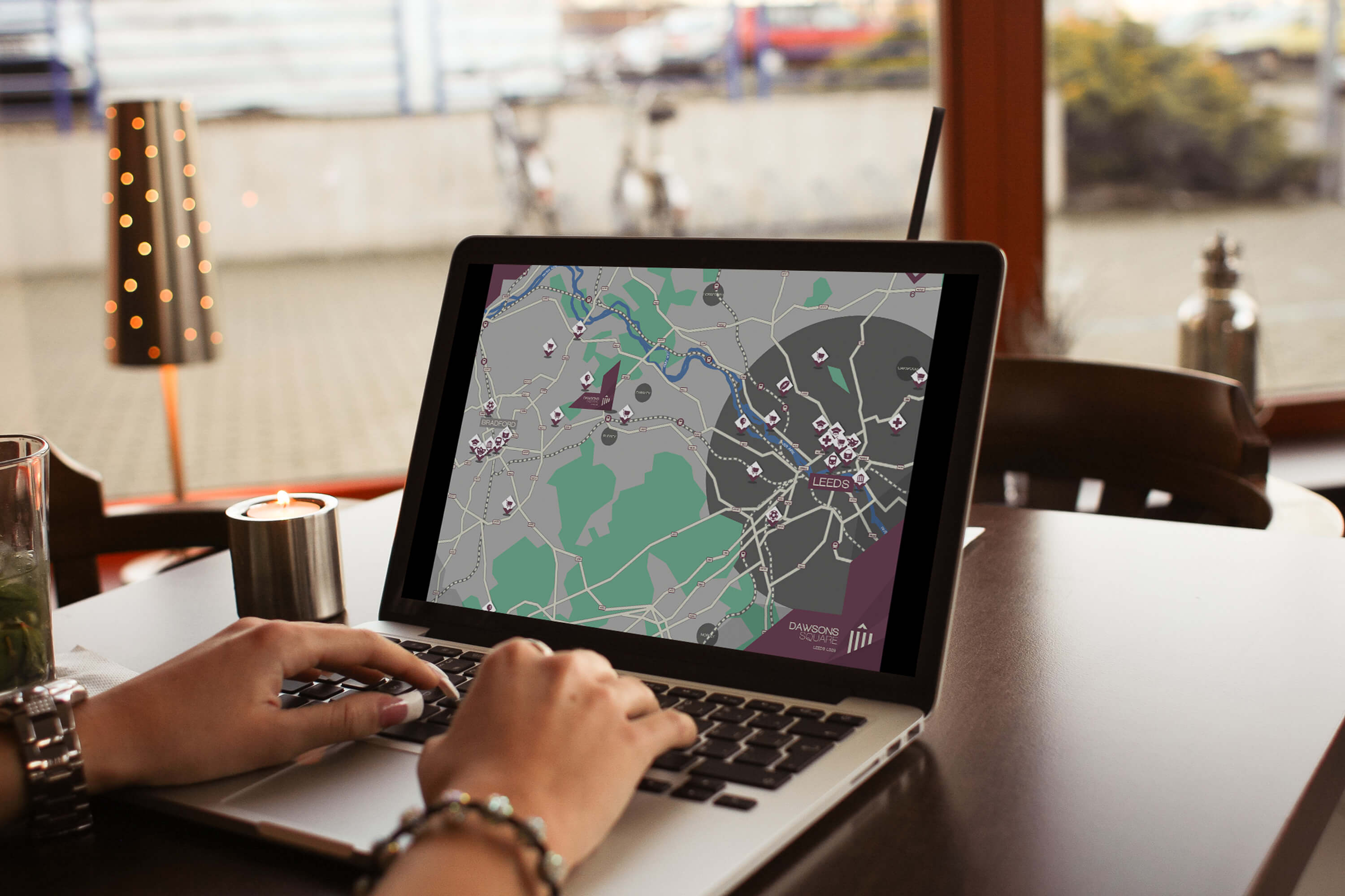
RBH Properties hired Tiny to design the new brand, online and marketing for their redevelopment of several buildings near Leeds, UK. With only a name and the architectural drawings for the development available, the task was to design a comprehensive identity that reflected the development's style and structure.
the concept
The concept for the Dawsons Square branding was taken from a part of the architecture. The gable frontage that is present on some of buildings provided the 'corner triangle' which was then used as a critical part throughout all designs. The logo itself reflects the front aspect of the Greenleigh building within the development. From this point, the three buildings within the developement were given their own colour scheme which mirrored their titles and environment.
the finish
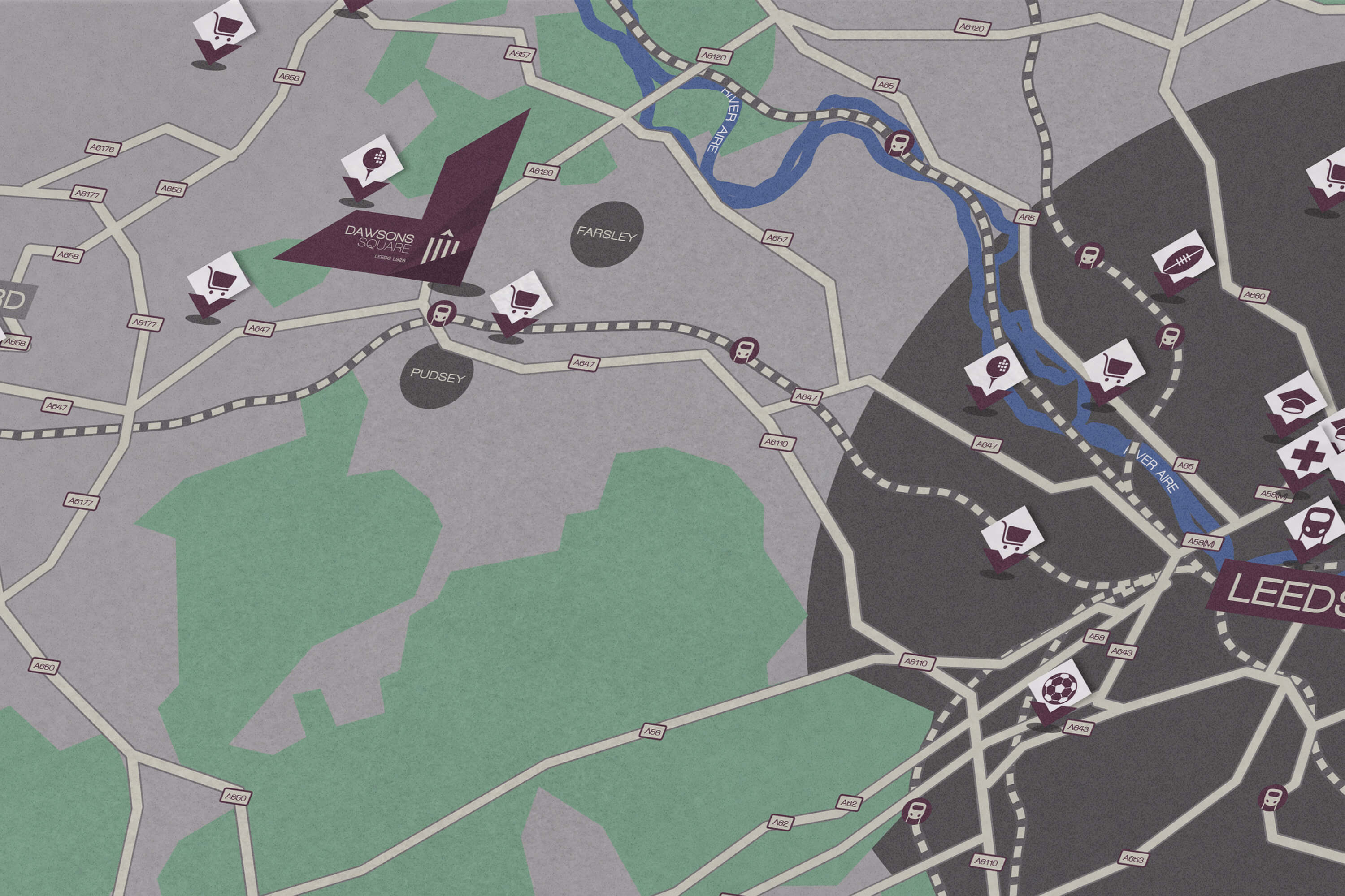
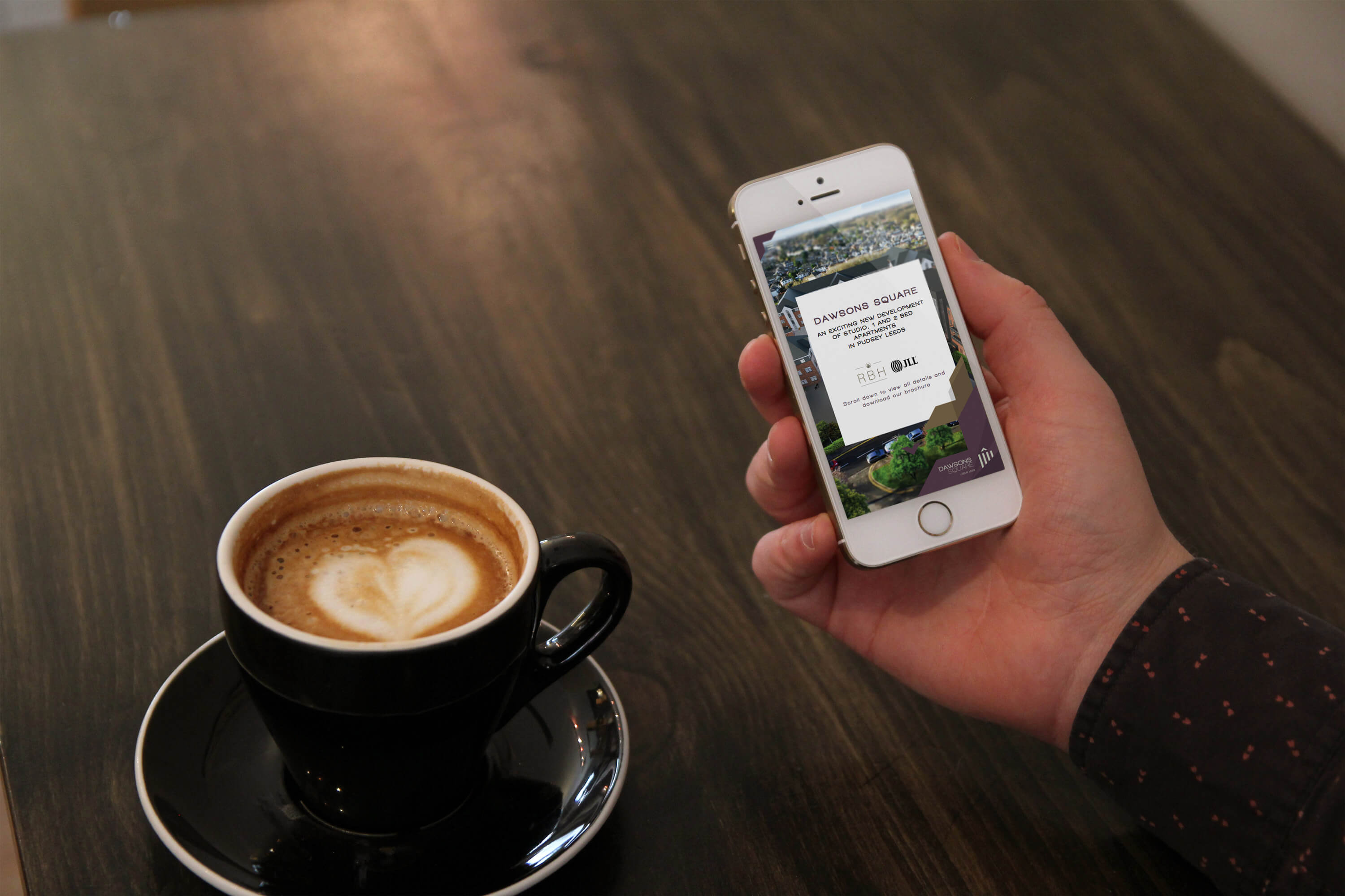
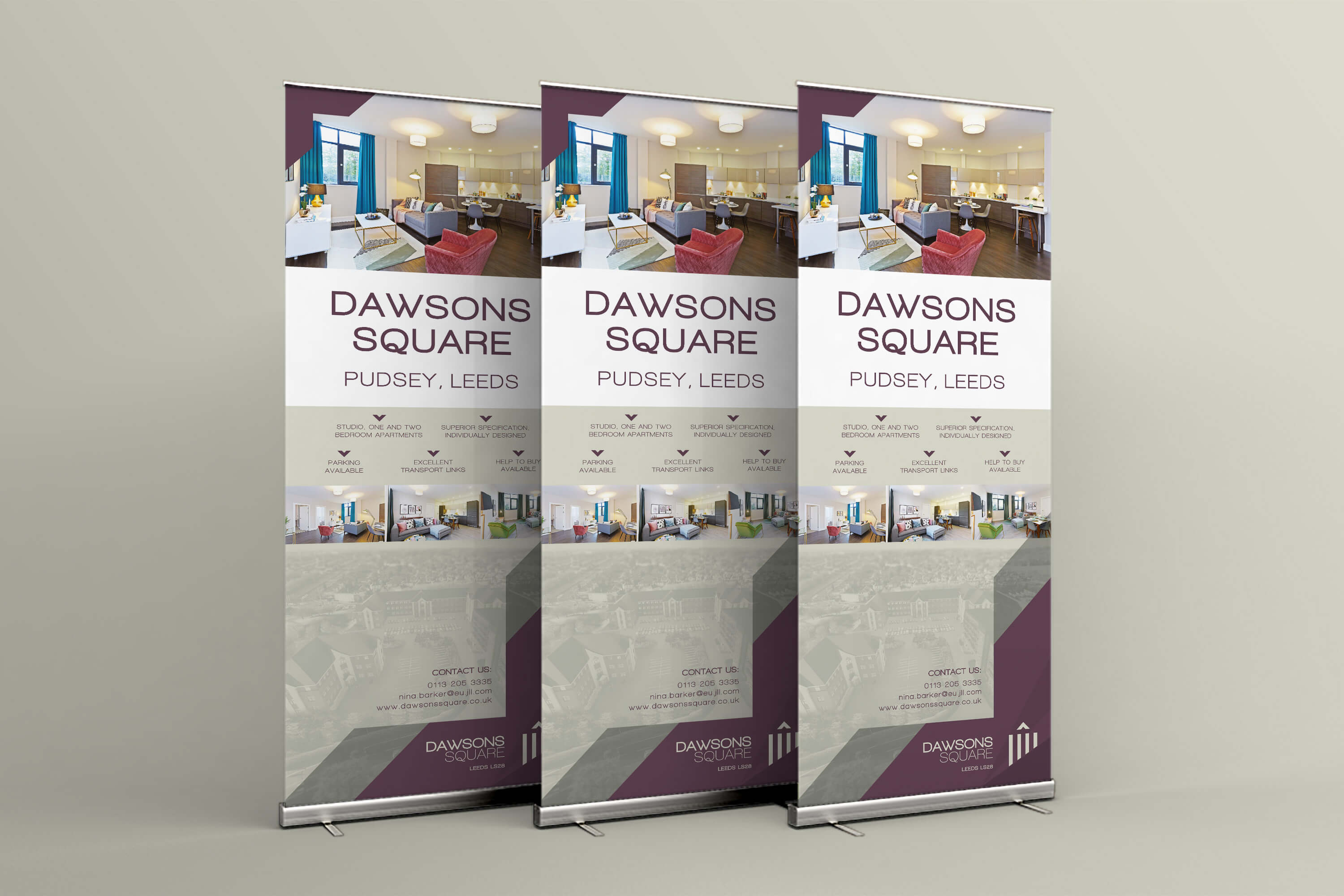
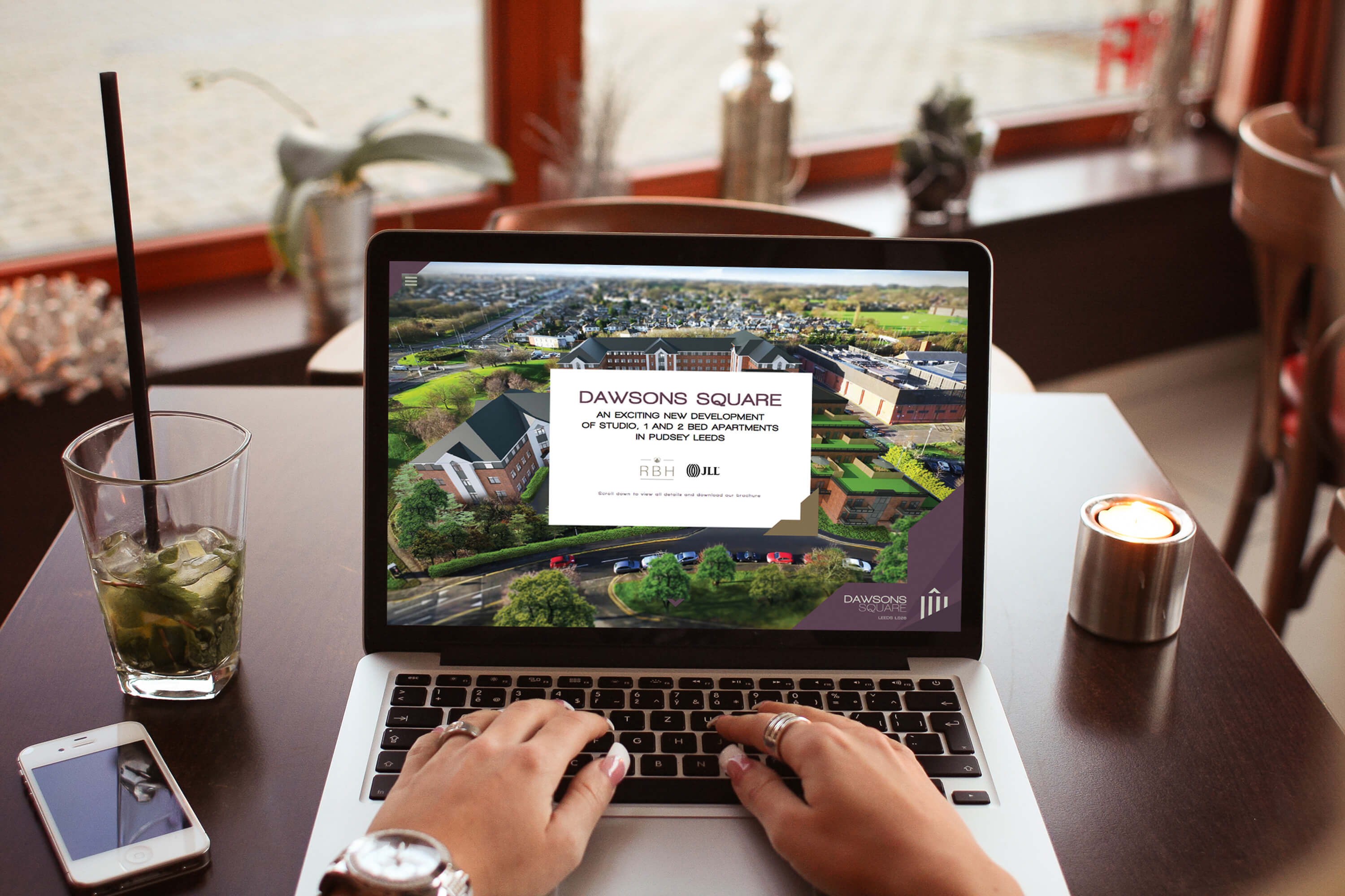
The finished project produced a digital brochure, a fully responsive and bespoke website with Wordpress admin area and no template in sight plus a host of marketing items including onsite hoarding, banners and signage. Bespoke maps based on the brand design were also drawn up and inserted online and within the brochures. Overall, a comprehensive design made sure that all of the development's marketing was striking and different!